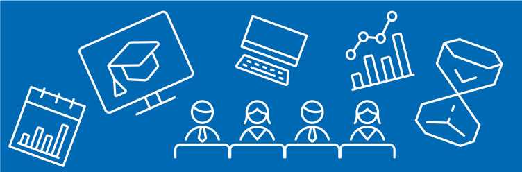
Workshops
Workshops on experimental and characterisation techniques and related equipment offer basic introduction and demonstration of techniques of relevance within the MaP community.
Upcoming Workshops
Currently no workshops. Please come again later or visit our events page.
The next Raman Workshop will take place in 2027 or 2028. If you would like to be involved, please contact us at or visit the dedicated website.
Please us if there is a topic or experimental technique you would like to learn more about.
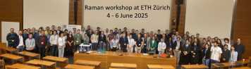
From 4 to 6 June 2025, the 7th ETH Zurich Raman Workshop brought
together experts and young researchers at ETH Hönggerberg to explore the latest advances in Raman spectroscopy and foster new connections in the
field.
More info and recap

The MaP ALIVE Symposium 2024 took place at ETH Zurich on 12-13 September 2024, marking the end of the first phase of the ETH ALIVE programme - Advanced Engineering with Living Materials. World-renowned speakers inspired the numerous participants with their keynotes, while ETH's ALIVE fellows and partners presented their cutting-edge research through scientific posters.
More info and recap
The 6th Raman Workshop took place from 7 to 9 June 2023 at ETH Hönggerberg. It featured talks of top-class Raman researchers, young scientists pitching their latest research, and equipment demonstrations. More info
The fifth edition of the ETH Raman Workshop with a special TERS satellite was held as an online event from 28 June to 2 July 2021. further information
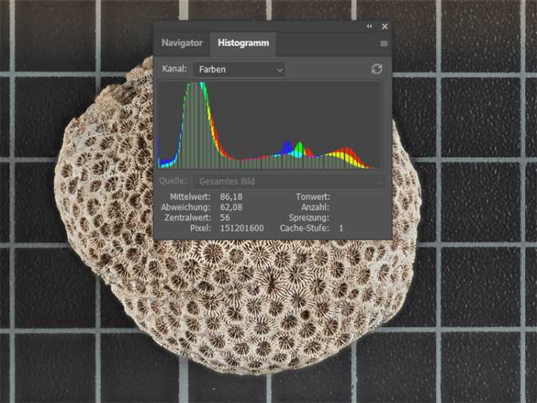
Meaningful photographs of test setups, experiments and the corresponding results are essential for convincing presentations and high-impact publications.
On 18 February 2021, our experts, Andreas Marx, Ralph Rosenbauer and Kai Pfaffenbach laid the theoretical backgrounds and shared numerous very practical tips & tricks in a 2-hour online session with the over 60 participants.
Andreas Marx | Marx Studios
Andreas Marx has decades of experience in studio photography and acts as an auditor at master certificates for photographers.
Kai Pfaffenbach | Reuters
Kai Pfaffenbach is an internationally working photojournalist who was awarded the World Press Photo Award in 2017 and won last year with his colleagues from Reuters the Pulitzer Prize (in the "Breaking News Photography" category).
Ralph Rosenbauer | MaP - additivETH
Ralph Rosenbauer worked several years in the photographic industry and is sharing his knowledge in workshops in different countries.

The fourth edition of the ETH Raman Workshop took place between 03 to 05 June 2019 at ETH Hönggerberg. Again, the workshop was organized by an interdisciplinary organising commitee from D-CHAB, D-MATL and D-MAVT. further information
To promote this increasingly important topic, the Competence Center for Materials and Processes (MaP) has organized the “Science Communication Series 2019”. Five topics have been tackled in different formats – such as workshops, lectures and lunch lectures.
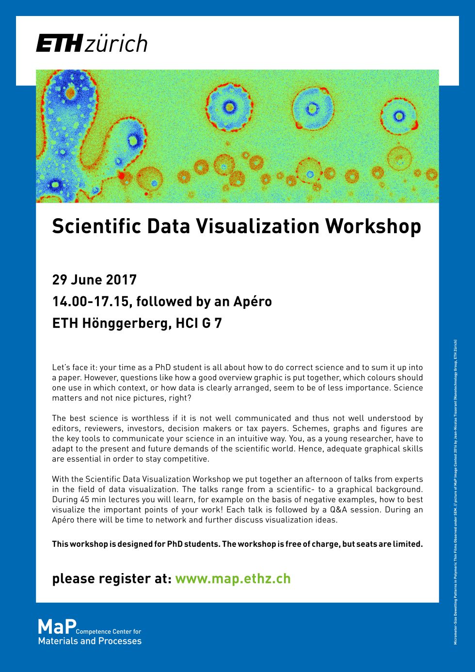
23 January 2019: Kick Off Event - Visual Exploration and Presentation of Scientific Data
Visual Exploration of Scientific Data
Data visualization is the science and practice of creating interactive graphical representations from data. In exploratory data analysis, visualization is the method of choice when the analysis objectives cannot be crisply and formally specified – i.e., when looking for regularities (patterns, trends,…) or irregularities (outliers, anomalies,…) in the data in an “I-know-it-when-I-see-it” manner. Visually supporting such a loosely defined analysis scenario requires versatile and highly interactive visualizations that can be changed and adjusted on the fly as the data analyst gains insights into the data. This first part of the lecture looks into the problems, principles, and practices of creating such exploratory data visualizations. It will introduce concepts of interactive data visualization, such as overview & detail, focus & context, and brushing & linking. Each of these will be exemplified with visualizations taken from current research to not only show the fundamentals, but also highlight the current state of the art in the field of data visualization.
Visual Presentation of Scientific Data
Once data has been analyzed, the results of that analysis need to be communicated. This is often supported by suitable graphics of the data, the results, or both. The craft of generating such graphics requires skills from a variety of areas, such as computer graphics and graphic design. As researchers from other fields than visualization can hardly be expected to be proficient in these disciplines as well, the field of visualization has produced a number of guidelines that – if followed – can serve to direct the creation of graphical representations so that they are expressive of the underlying data and effective for their intended use. This second part of the lecture introduces some of the most important guidelines on how to visually encode data by leveraging what we know about visual perception and cognition. These guidelines can be used as rules-of-thumb when generating visualizations for one’s own research data, or when discussing other’s visualizations in writing clubs or peer reviews.
Hans-Joerg Schulz is an associate professor at the Department of Computer Science at Aarhus University in Denmark. He received his doctorate degree in 2010 from the University of Rostock, Germany and has since worked there in various capacities with a number of intermittent research stays at TU Graz, University of Calgary, and Fraunhofer IGD. In 2018, he moved to Aarhus where he now works in the fields of Information Visualization and Visual Analytics. His research focuses on novel methods for the visual analysis of structured data – in particular hierarchically and network-structured data, but also data that is organized by spatio-temporal relations or similarity. In collaboration with industrial and academic research partners, he applies his methods predominantly to data analysis challenges in the life sciences and geosciences. In his free time, he collects tree visualization techniques at external page treevis.net.
20 February 2019: Software Options for Data Visualization
Whether it is an article on your group webpage, a graphical abstract for a scientific journal or your spin-off company portfolio, presenting your scientific data outside from the conventional journal article becomes more and more important. Choosing the correct tool to transport your scientific data is therefore a major key factor in Science Communication. Nowadays, simple diagrams like bar plots or curves often seem very basic – if not boring – compared to all the opportunities that digitalization offers. But which tools exist and which would be the most suitable to present your data within a given framework?
In his talk, Oliver Hümbelin will cover the basics of tooling, its prerequisites and opportunities with respect to the available data. New and innovative tools, e.g. D3 (Data Driven Documents), a tool to produce dynamic, interactive data visualizations will be discussed in more detail. By means of examples, you will be introduced to and inspired by a completely new approach of scientific data visualization!
Oliver Hümbelin is co-director of studies CAS Datenanalyse as well as a principal investigator and research scientist at the Bern University of Applied Sciences (BFH) Centre for Social Security. He received his doctoral degree in 2016 from University of Bern, Switzerland. In 2017 he attended a Data Visualization course with d3.js, which is designed by Kevin Quealy – a graphics editor and reporter at The New York Times.
Being a sociologist by training, his research interests focus mainly on inequality and poverty in Switzerland and how to mitigate their causes and consequences. Within the frame of the CAS Datenanalyse he is teaching graphical data exploration and data visualisation. Personally, he is fascinated by various tools, methods and new data that continuous digitalization offers. His special interest lies in finding a better way to transmit scientific results to the public using Data Visualization which – in his opinion – do often not find their way into the public discourse.
20 March 2019: The Scientific Poster
Crafting Beautiful and Effective Scientific Posters
It's impossible to be a scientist without being a science communicator. Among the many ways of how research can be disseminated, conference posters provide unique opportunities and challenges that are distinctively different from scientific publications. This talk will provide a brief introduction on how to create effective posters to communicate scientific results. We will explore some fundamental principles of graphic design and how they can be applied to scientific visualization. More specifically, we will examine how we can exploit these visual considerations when creating a scientific poster. The audience will also learn how to avoid technical pitfalls related to topics that include file formats, color spaces and image resolution.
Sam Hertig is a software engineer and scientific visualization specialist. After a Masters degree in physics at Bern University and a PhD in computational biology at ETH Zurich, he moved to California to work on molecular modeling and visualization projects at UCSF and Stanford University. In 2016, he founded Hertig Visualizations and started creating graphics, videos and interactive visualizations for clients in industry and academia (external page Hertig Visualizations). An avid presenter at various academic institutions in the US and Europe, he enjoys giving talks and leading workshops on scientific visualization and conference poster design. Sam currently works as a software engineer at Comerge, where he develops software for augmented reality applications in the field of medical imaging, and supports clients in visualization-related projects.
April 2019: Pitches and Speed Presentations
Preparing and Delivering Pitch, Speed and Short Presentations
In the world of international business, the ability to communicate a message effectively and make a professional presentation is indispensable. Moreover, the challenge of presenting complex, scientific data to audiences that are not familiar with the concepts or content can seem like an insurmountable obstacle. How can we get ‘lay’ people to understand our key messages, and how can we do this when we have little time to prepare and even less time to actually deliver those messages?
In this short course you will “learn-by-doing” how to give an effective presentation in a variety of different contexts and to a variety of different audiences. The course will focus on how to get your message across, achieve your aim and inspire your audience. We will look at the importance of structure, of a powerful introduction and conclusion, how to connect with your audience, how to look and sound confident and convincing.
Jane Everett is an associate professor of Intercultural Competences and International Business Communication in the Economics Department at LIUC, Università Cattaneo in Italy and teaches Intercultural Presentation Skills at EPFL in Lausanne. She also delivers leadership skills at management level in private companies and is a Licensed Springboard Women’s Personal Development Trainer. After starting her professional career as a translator and interpreter from Russian, she transferred to the training industry and developed the Russian market for many years for a London-based management training company. In 2001 she moved to Italy, becoming a freelance trainer, eventually taking up an academic post developing Intercultural Competences on the ERASMUS and Masters programs, which she also runs as visiting professor at partner institutions including BSB in Dijon. She also specializes in expatriate relocation coaching.
May 2019: Infographics
Infographics are a visual representation of information and aim at a clear and easy understandable presentation of – often complex – data. Infographics exhibit a wide spectrum of possibilities such as showing patterns, trends and multiple dimensions in one scheme. During this lunch lecture, Miriam Dahinden-Ganzoni will give a brief introduction into infographics, their possibilities and impact, important points to be considered, supported by various examples from her own, but also external work.
Miriam Dahinden works as a graphic designer at the Center for Security Studies (CSS) where she is responsible for the design and layout of the CSS publications. Before joining the Center in 2011, she worked in the fields of magazine, corporate and security design in Lucerne, Berlin and Zurich. Miriam Dahinden received her degree in Graphic Design from the Lucerne University of Applied Sciences
The Additive Manufacturing and Biofabrication Summer School 2018 (AMBSS) took place from 27 to 31 August 2018 at ETH Hönggerberg.
From 13-15 June 2018, an interdisciplinary team of doctoral students from ETH departments D-CHAB, D-MATL and D-MAVT have organised the 3rd Raman Workshop at ETH Zurich. further information
On 29 June 2017, Kirstin Casdorff, Sanja Kostic and Christian Goldhahn (Wood Materials Science) organised a Workshop on Scientific Data Visualization.

On 6-8 June 2017, Jakub Jagielski, Tian Tian & Dr. Wen-Yueh Yu (Lab for Interface and Surface Engineering of Nanomaterials) organised a Workshop on Raman Microscopy.

On 3-5 February 2016, Jana Segmehl & Kirstin Casdorff (Wood Materials Science) & Sebastian Schweiger (Electrochemical Materials) organised a Workshop on Raman Microscopy.
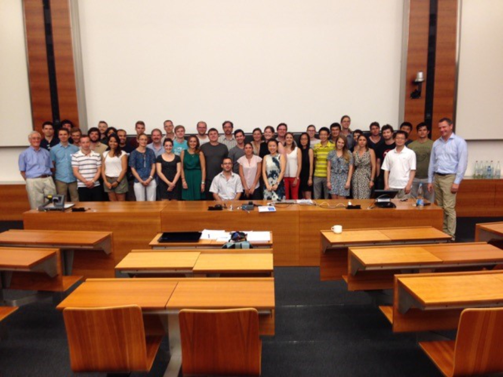
On 7-8 July 2015, MaP member Prof. Jan Vermant (Laboratory of Soft Materials, Department of Materials) co-organised with the Competence Center for Materials and Processes (MaP) an intensive short course on colloidal suspension rheology with Jan Mewis and Norman Wagner.
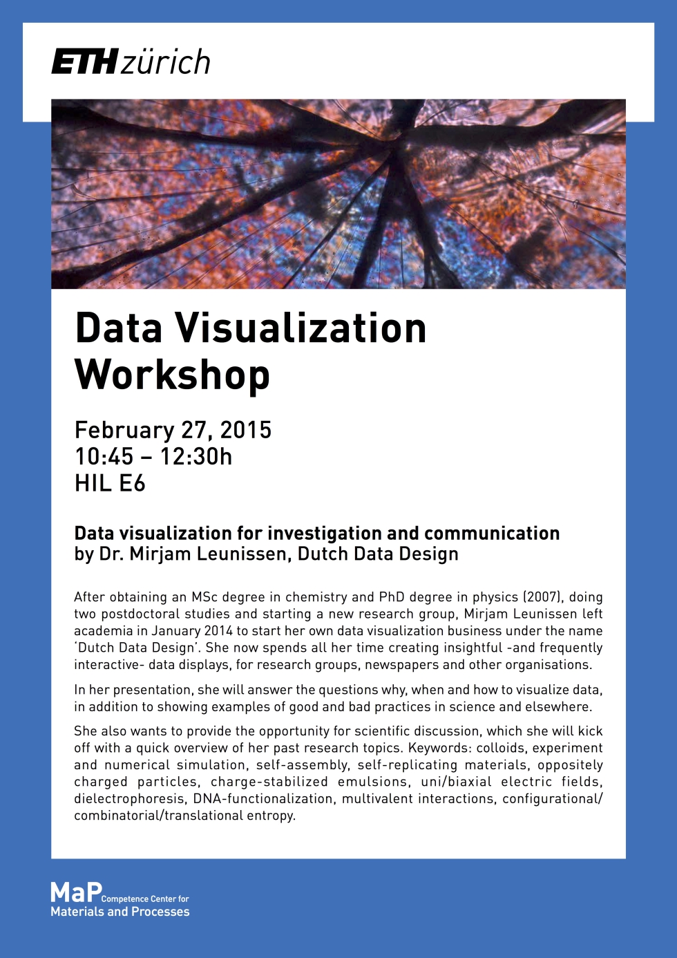
On 27 February 2015 Dr. Mirjam Leunissen of external page Dutch Data Design talked about "Data visualization for investigation and communication" in HIL E 6, at ETH Hönggerberg.
Program
- 10:45-12:30 Presentation by Dr. Mirjam Leunissen (A) overview of past research topics & (B) data visualization and design
- 14:00-17:00 individual meetings with the speaker
About the speaker Dr. Mirjam Leunissen
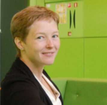
After obtaining an MSc degree in chemistry and PhD degree in physics (2007), doing two postdoctoral studies and starting a new research group, Mirjam Leunissen left academia in January 2014 to start her own data visualization business under the name ‘Dutch Data Design’. She now spends all her time creating insightful -and frequently interactive- data displays, for research groups, newspapers and other organisations.
Former research topics: colloids, experiment and numerical simulation, self-assembly, self-replicating materials, oppositely charged particles, charge-stabilized emulsions, uni/biaxial electric fields, dielectrophoresis, DNA-functionalization, multivalent interactions, configurational/combinatorial/translational entropy.